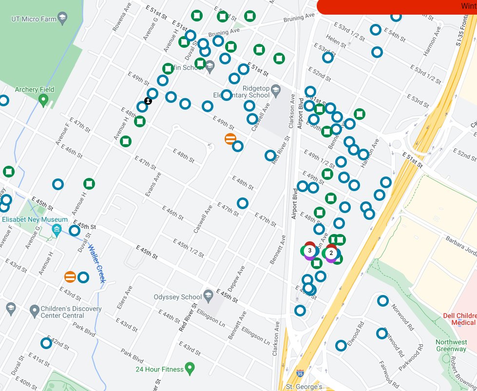
I will certainly admit to being confused about this and I’ve had to use this map a lot in the last few years
with quote tweet:
@AlexKarner ("@alexkarner@mastodon.social (Alex Karner)") wrote:
Since I've been staring at it for a few days, I have notes on the @austinenergy map from someone who thinks a bit about cartography.
tl;dr: The symbols and colors used are extremely unintuitive and the map provides no information about how the nearby outages are related.