Mastodon Feed: Post

Mastodon Feed

Boosted by pluralistic@mamot.fr ("Cory Doctorow"):
clive@saturation.social ("Clive Thompson") wrote:

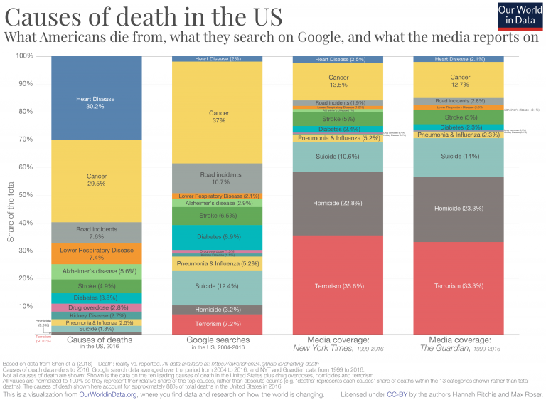
I always find this chart by Hannah Ritchie -- of Our World In Data -- deeply informative of how disjointed is our sense of personal risk

https://x.com/%5FHannahRitchie/status/1133703638432526337

A stacked bar chart titled "Causes of death in the US: What Americans die from, what they search on Google, and what the media reports on". It compares what people actually die from versus what people search for on Google, and what the NYT and Guardian report on. It neatly illustrates that while people are most likely to die from cancer and heart disease, they search very little for heart disease, and focus too much on diabetes, suicide, and terrorism. Meanwhile, the media sources focus a wildly disproportionate amount on terrorism, homicide and suicide, while virtually ignoring heart disease. Some number: In reality, people die mostly from heart disease (30.2%) and cancer 29.5%. There are much smaller shares for road incidents (7.6%), lower respiratory disease (7.4%), Alzheimer’s (5.6%), stroke (4.9%), diabetes (3.8%),. Suicide is only 1.8%, homicide only 0.7%, and terrorism is barely 0.01%. The media are even more out of whack with reality: The NYT and Guardian devote 35.6% of their death-related coverage to terrorism and 22.8% to homicide, while devoting only 13.5% to cancer and barely 2.3% to heart disease. The media sources devote roughly 13% of their death-related coverage to cancer, about half as much as it occurs in reality. Basically, the chart shows that while people and media perceive the role of cancer somewhat accurately in causing, people overstate the role of terrorism, homicide and suicide -- and media wildly overstate terrorism and homicide.